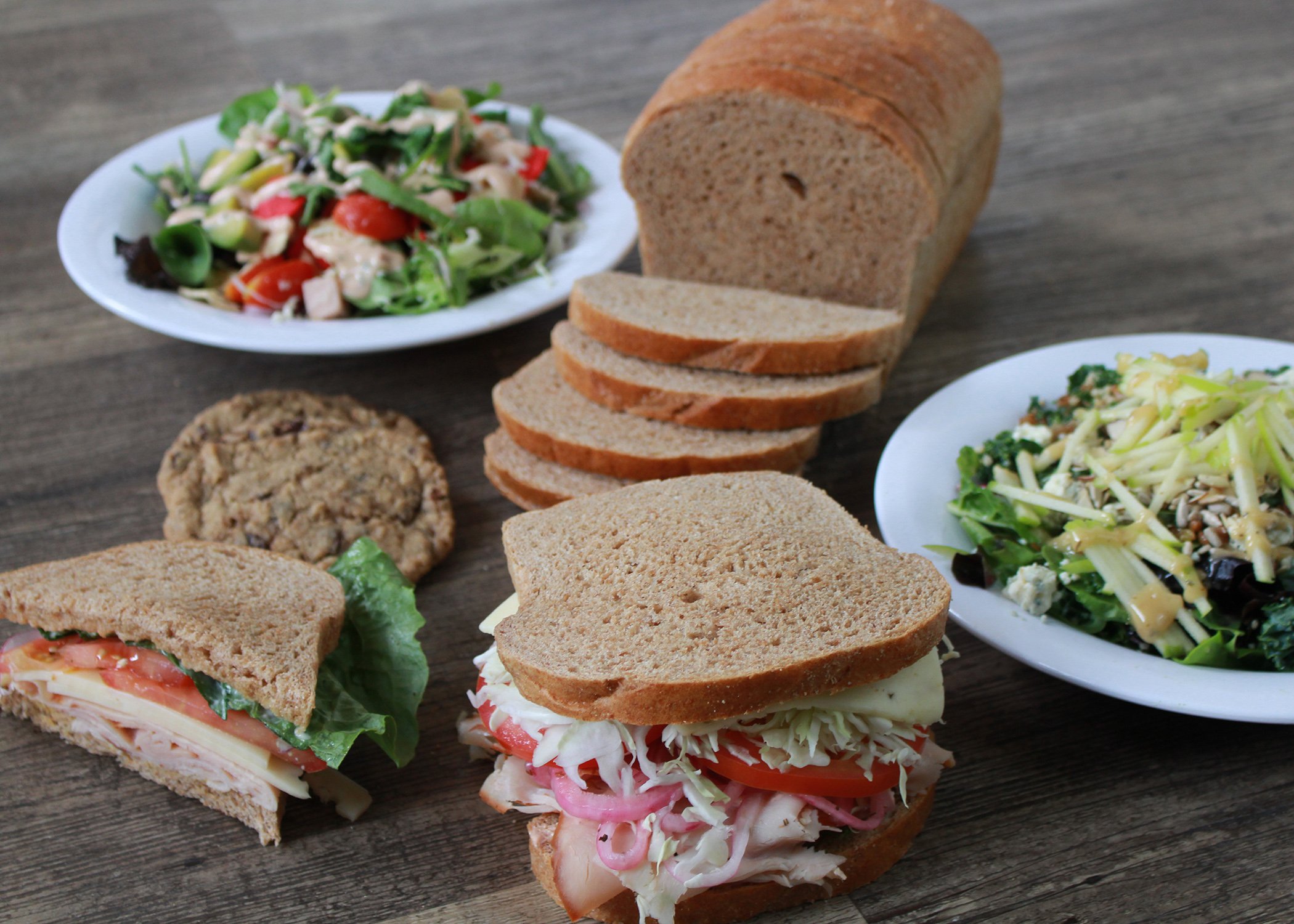
Earlier this year we decided to buy one of our own stores to have a bakery cafe near our office to use to test products and new systems. That has allowed us to exercise some of our own freedoms as they exist in the Freedom Franchise.
One of the most interesting exercises of this freedom has been deciding how to update the look and feel of the store. We sure aren’t all the way there, and the reboot is still in the future, but the general direction of the look has already allowed us to start thinking.
There are a few elements that are worth sharing now.
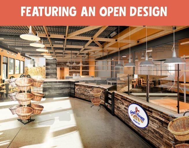
The first shot shows where we are headed in general with our new cafe concept. It features an open design so our customers can view the theater of production.
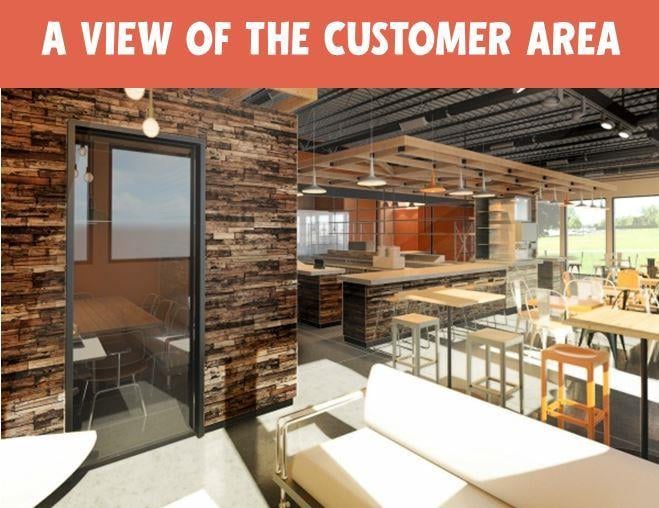
This second shot shows that view from the opposite angle, which allows you to understand just how open it is, and what the customer area looks like.
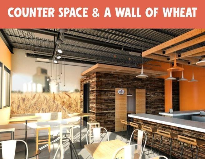
The third image allows you to see a few elements we are particularly excited about.
- Counter seating.
- A meeting room for charities to use—free of charge—to help spread their message in our communities.
- And a wheat wall.
The wheat that is the basis for all we deem fundamental to our bread is critical to our brand and message. This allows us to share that feeling with each customer in our stores every day. That is very exciting.
What do you think? We would love to hear your feedback as these ideas and looks are still formative.
Learn more about customization options available in the Freedom Franchise:
Read More About Design At Great Harvest Stores:


